

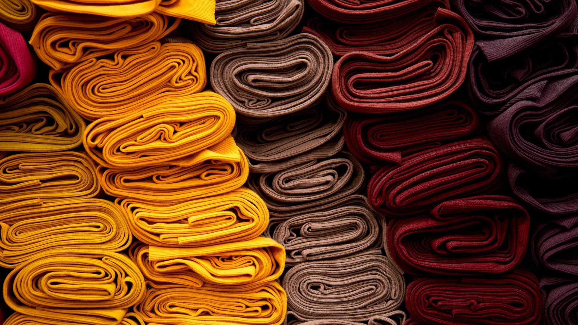
The autumn/winter 2028/29 fashion colours already have names. WGSN, the trend forecasting company, and Coloro, its colour coding system, have unveiled the five key shades of the season: Bloodstone, Liminal Yellow, Elemental Verdigris, Healing Turmeric and Smoky Amethyst. Forecasts come almost two years in advance because designers, manufacturers and retail chains use them to plan their collections.
The five autumn/winter 2028/29 fashion colours
Here are the shades, with the Coloro code that uniquely identifies each one:
- Bloodstone (011-27-26): a deep iron-oxide red, the season's reference colour;
- Liminal Yellow (046-75-28): a muted yellow, poised between comfort and unease;
- Elemental Verdigris (091-55-12): an aged blue-green, recalling oxidised copper;
- Healing Turmeric (030-70-36): a bright yellow-orange, warm and reassuring;
- Smoky Amethyst (146-36-10): a twilight purple with smoky undertones.
What these colours say
According to WGSN, Bloodstone is conceived as a grounded, human colour, a counterweight to screen glow: a shade that brings us back to physical presence and contact with our emotions. Elemental Verdigris speaks of restoration and things made to last; Healing Turmeric combines energy and stability; Smoky Amethyst evokes calm and refuge. Liminal Yellow, meanwhile, picks up the digital fatigue of younger generations, with a deliberately subdued tone.
The common thread, in the words of those who built the palette, is longevity: colours you can wear for a long time, far from one-season trends.
Trends and colour analysis: how to reconcile them
A trend colour isn't necessarily a colour that flatters us. Anyone who has had a colour analysis knows it: the same red can light up one face and dull another. The point isn't to chase the season's palette, but to understand which of its shades speak to your own.
A few general pointers:
- deep reds like Bloodstone tend to flatter those with intense, warm natural colouring;
- blue-greens like Elemental Verdigris are often easier to wear for those with cool, muted tones;
- yellows, both Liminal Yellow and Healing Turmeric, are the most delicate: near the face they should be chosen with care, while on accessories and garments away from the face they're easier;
- the smoky purple of Smoky Amethyst can become an alternative to black for those who find it too harsh.
These are general pointers: confirmation only comes from a colour analysis carried out on the person.
Why forecasts matter even if you don't work in fashion
Seasonal palettes end up in shops, in company uniforms, in displays. Knowing them in advance helps you build a wardrobe that doesn't depend on the latest trend: you choose what flatters you and what lasts, and add the seasonal note only where it makes sense.
The right colour is the one that represents you
The autumn/winter 2028/29 palette speaks of presence, longevity and authenticity: the same values as good image consulting.
In CG Imagine's C(h)IC® Journey, colour analysis is one of the tools of the image strategy: it helps you understand which of the season's colours, from Bloodstone to Smoky Amethyst, can enter your wardrobe without betraying who you are.
Sources
- Coloro, Key Colors A/W 28/29
- WGSN, colour forecasts produced with Coloro
Photo by Victor Volkov on Unsplash